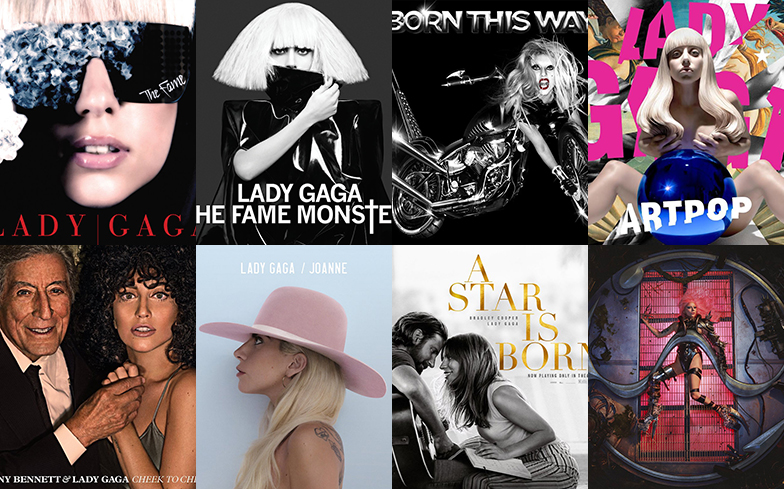
Does Chromatica come out on top?
Iconic is a word that’s become overused and, as a result, heavily watered down by pop culture fans, but there’s no denying that one woman who deserves that descriptor is Lady mother-tucking Gaga.
As well as delivering some of the biggest hits of the last decade (and arguably some of the best pop albums of all time), her creativity also shines in her visuals, whether that’s through performances, music videos or costumes.
To mark the artwork unveiling for her hotly-anticipated upcoming album Chromatica – a moment that left fans well and truly gagged – we’ve ranked all of her album covers from worst to best.
8. A Star Is Born

Of course we stan A Star Is Born, but there’s really not much to say about this album cover as it’s essentially a square version of the movie poster, so it was an easy last place.
7. Cheek To Cheek

While we can’t deny Gaga’s friendship with jazz superstar Tony Bennett is adorable, and we loved seeing our favourite pop star show off her vocal range and diversity, Cheek To Cheek isn’t an album we revisit all that often. We feel much the same about the cover – it does the job, but isn’t a standout.
6. Born This Way
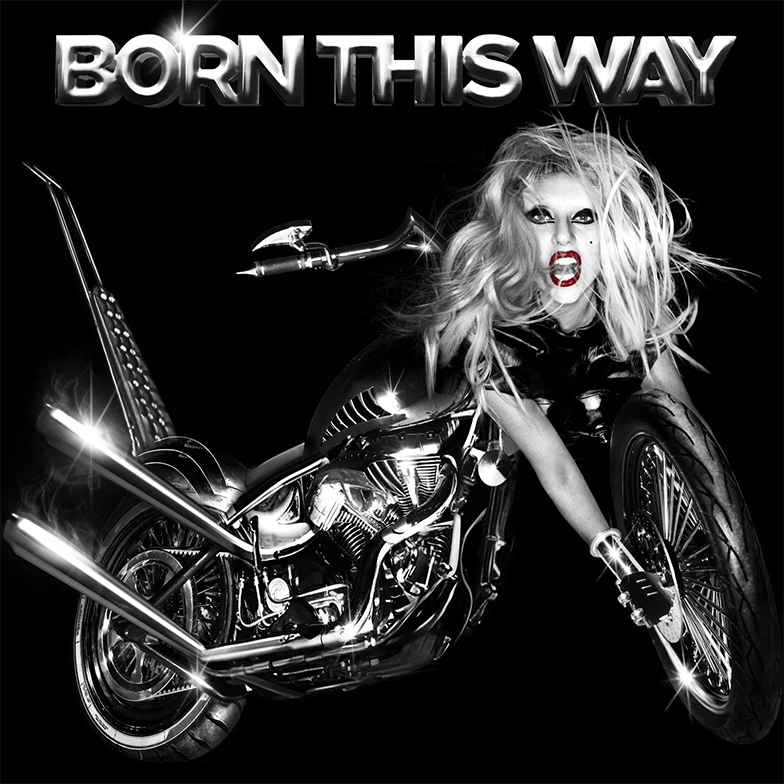
Despite being considered her best body of work by many fans (especially queer fans for whom Born This Way was the soundtrack to their coming out journey), the same praise isn’t often given to the album’s cover. The concept of Gaga’s head on a motorcycle baffled most when it was unveiled, and didn’t seem to fit with the concept of the record – especially when the rest of the album’s imagery was so great. And that typeface is… a choice. Still, it’s definitely one of her most memorable images, and it got people talking, which is what Gaga does best. We prefer the deluxe cover, a close-up of the singer’s face with the overarching Born This Way font, which most fans consider to be the true album cover anyway.
5. The Fame

As far as debut album covers go, The Fame was a great effort, featuring several staples from the era – oversized sunglasses, that signature platinum blonde wig with the bangs and even a little peek of her disco stick. We’re not sure if the image itself is iconic, or it just spent so long on the charts that you couldn’t avoid seeing it in every record store through the tail end of the 2000s, but either way it’s a cover that will be remembered.
4. Joanne

Gaga’s country-leaning album Joanne may have been the opposite of ‘giving the gays everything they want’ in the eyes of some fans, but there’s no denying that the album cover, with its pastel hues, is gorgeous. Unlike the big concept and heavy details of her other covers like ARTPOP and Chromatica, this is stripped back and simple, and it works. As far as album campaigns go, this was probably Gaga’s most consistent and cohesive, and it’s largely thanks to that baby pink cowboy hat – you’ll struggle to pin any other era down to a single look, but for Joanne it’s easy.
3. ARTPOP

Gaga’s fourth studio album ARTPOP was her most ambitious yet, and saw her at her most chaotic both musically and visually. That vibe was perfectly encapsulated by the album’s cover, for which she achieved her goal of merging art with pop. The background features cutouts of Botticelli’s The Birth of Venus, a reference to one of the album’s standout tracks, and Bernini’s statue Apollo and Daphne, featuring the god of music Apollo. So far, so very Gaga. But place a larger-than-life statue of the pop icon created by legendary artist Jeff Koons in the centre, and it becomes a masterpiece.
2. Chromatica
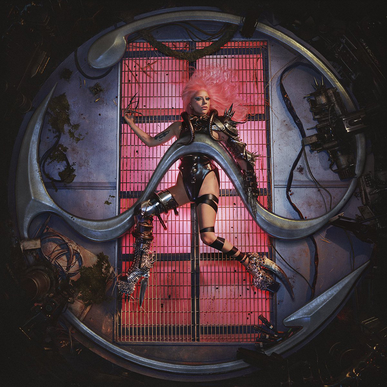
We might be biased due to the excitement of it being the newest addition to Gaga’s discography, but we feel pretty confident saying the Chromatica album cover is one of the best we’ve ever seen. The robotic fashion, the contrast between the hot pink and the grimy metallic surroundings, the inclusion of the sine wave symbol, and the attention to detail – we particularly like the tribe symbols featured in the top right corner – elevates the image from album cover to a work of art. Now we just need a release date, Gaga.
1. The Fame Monster

The glow-up from The Fame to The Fame Monster, as Gaga made the transition from wannabe pop star to the biggest pop star in the world in the space of a year, was incredible. While other artists followed the trend of re-releasing albums with extra tracks as quick cash-ins, Gaga made her eight-track EP a pop culture moment. The whole album photoshoot from Hedi Slimane was so stunning that any image could have been chosen as the cover, but there’s something undeniably striking about Gaga’s eyes peering through the black pleather as her signature platinum blonde hair goes wild. Alongside the deluxe cover, where Gaga is pictured with dark hair and a single tear, the image captures the feel of the album perfectly. It’s the definition of iconic.
Latest